GRASSIMPLY
LOGO/BRANDING (2019)


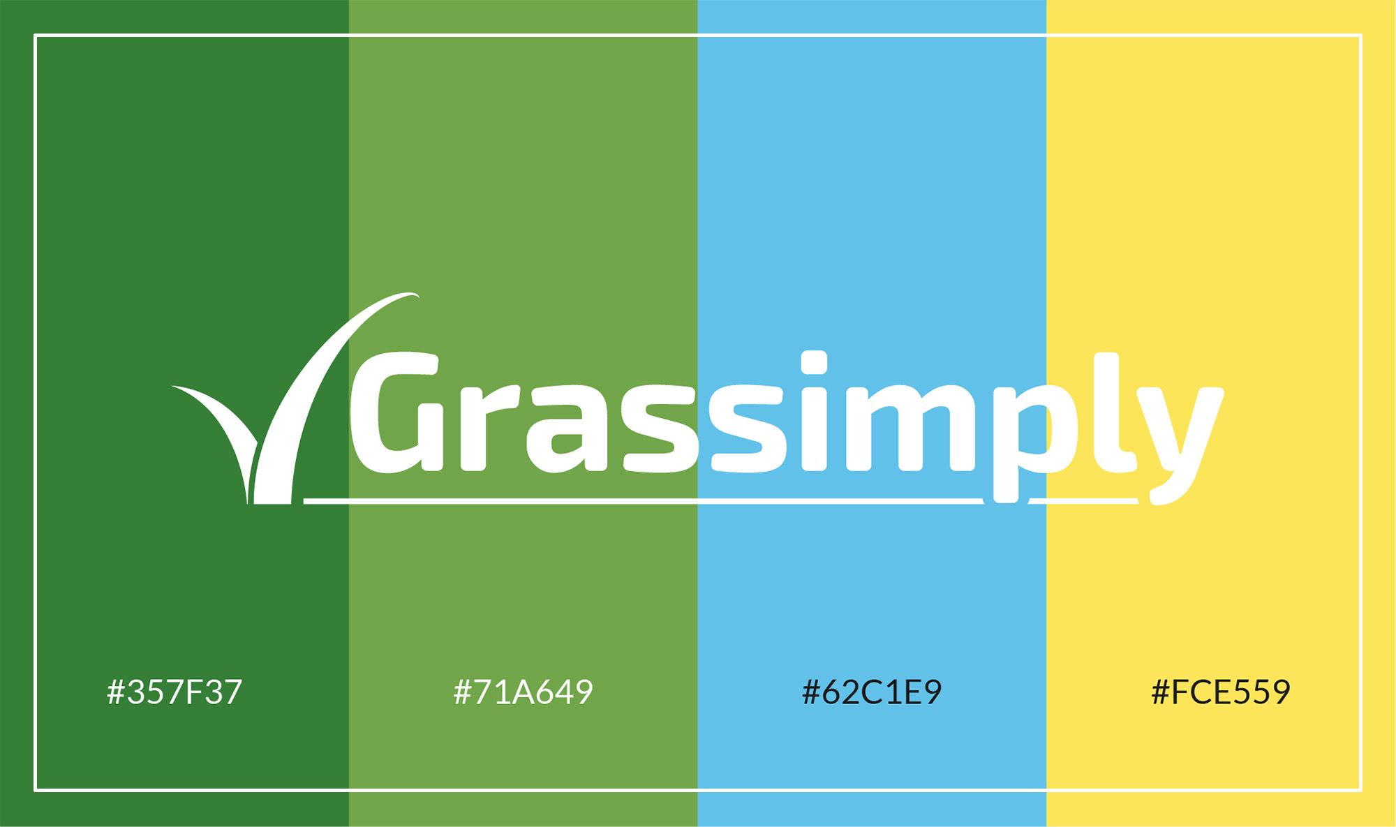
My role: to create a company logo and provide some basic branding concepts. I hit upon the idea of the tick, a visual symbol that resonates with the name of the company, whilst also depicting a stylised image of the product ( i.e. blades of grass). My starting point, in terms of personality, was for a clean, professional brand image. I wanted to reflect the message of the company name - grass simply - with a minimal, unfussy design. The rounded lettering is intended to project a friendly, non-threatening personality. I then introduced secondary colours to build the identity and add a little fun and vibrancy to the brand.
These ideas are just the first step; this is a new and developing business, with the pentential to grow over the coming months!
These ideas are just the first step; this is a new and developing business, with the pentential to grow over the coming months!

